

Parcel Design System
Curated for
RapidResponse
BACKGROUND
In 2020, Kinaxis announced the transition of RapidResponse from its previous Java client to a web-based interface, creating an entirely new set of user experiences. This initiative presented an ideal opportunity to introduce a design system, aiming to minimize bugs, streamline development efforts, and establish a consistent modern look and feel for the application.
Check out my design system journey in the Kinaxis blog post below! 👇
ROLE
Design Lead
Building the project vision, planning and project scoping, stakeholder buy-in, market research, style guide creation, component creation, documentation, and publicizing the design system within the company.
TEAM
JM Jones (Designer), Emily Ong (Designer), Rachel Xu (Designer), Rose Zhang (Designer), Evan Knox (Developer Lead), Front End Development Team contributors
DATE
2020 - Present


It all started with a button
Why did we need a design system?
We chose to build our UI designs using Google’s Material Design as a foundation. However, the buttons we created for the application had a slightly denser design than Material UI, requiring developers to make adjustments each time to align with our UX specifications. Over time, this led to numerous instances of inconsistent button sizes. To address this, I conducted an inventory of all the various button sizes within the application, along with other UI inconsistencies, and successfully advocated to stakeholders the need for implementing a design system.

My goal was to establish a Design System as the central point of reference for all teams involved in product creation and user-facing UI development. This system would empower everyone to consistently design, develop, and maintain product quality.
Building it from the ground up
I extensively researched design systems through countless articles, webinars, and conferences in order to understand what is needed to build one from scratch. Then, I collaborated with the lead developer to devise a strategy to kickstart this project.
We branded the design system as 'Parcel,' complete with its unique logo to generate excitement and awareness. We then officially launched it within the UX and Development teams.

Logo created by JM Jones
Design Tokens
A common element found in many design systems is the concept of design tokens, which serve as the fundamental building blocks of such systems. I established Parcel's foundations by defining design tokens for color, typography, spacing, and iconography. I’ve taken inspiration from Google’s Material Design, while modifying them slightly to match the RapidResponse aesthetic, These design tokens are employed across all Parcel components.

Atomic Design Components
I applied Brad Frost's Atomic Design methodology, creating small components from these foundations. Over time, these solid smaller components were used to construct larger ones. I presented these examples to both the design and development teams, establishing a standardized approach for creating components.

UX Style Guide
I compiled all the components into a comprehensive UX style guide. This guide serves a dual purpose: providing clear instructions on how to use each component and serving as a single source of truth for all components.
The style guide consists of:
General specifications for each component
Different states of each component
How to use each component
Special treatments
Component documentation

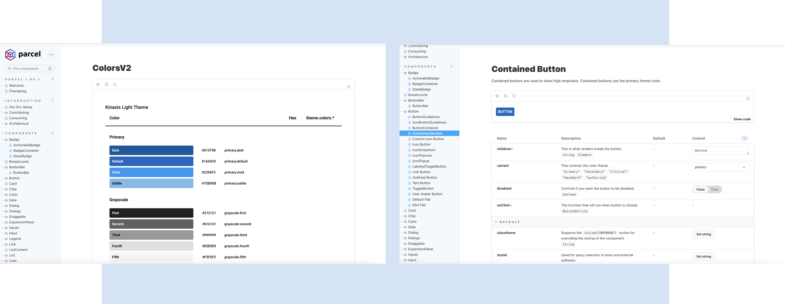
Developer Storybook
Developers utilized the components from our UX style guide to create functional components through Storybook. The UX team and I maintained a highly collaborative relationship with the development team, ensuring the success of the Parcel webpage.
With the launch of Parcel, it has been shared across various teams responsible for different aspects of the application. Currently, Parcel is being utilized in the main web client, machine learning app, integration mini-apps, and visualizations. Its value has also been evident during mergers and acquisitions with other companies. Parcel ensures a consistent user experience, regardless of the team creating the user-facing UI, resulting in a cohesive and polished product.
Vision
The vision for Parcel extends to becoming a company-wide initiative, encouraging contributions from all departments. Ultimately, the Parcel website will become Kinaxis' central hub for creating user-facing UI, ensuring rigorous reviews and testing for higher-quality components.